In this tutorial I will show you how to create the carbon fiber website header that was used at projectcrankwalk.com . You will use a simple gradient with a pattern overlay to create a unique effect. I hope you enjoy.
Here is the finished product, click to enlarge:

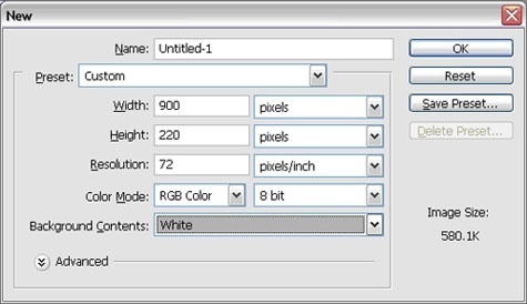
Start off with a new image width: 900 height:220 background: white.
Create a new layer and draw a rounded rectangle width a radius of 10 (you can use any color that will set the object apart from the background. I chose orange).

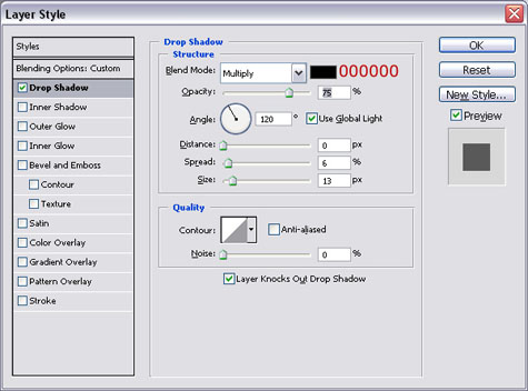
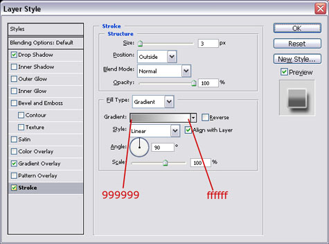
Apply the following layer styles:
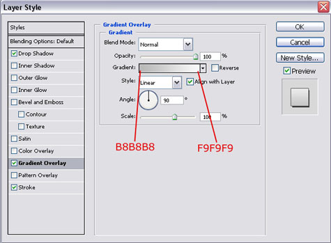
Gradient Overlay:
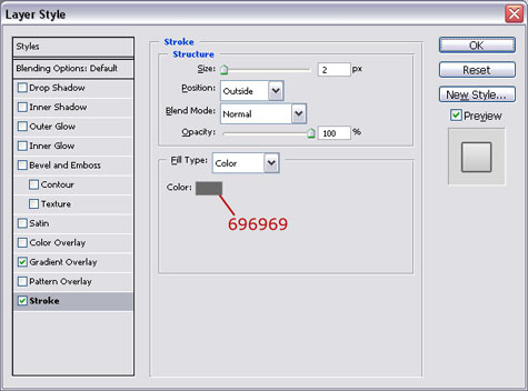
Stroke:
Your image should look something like this:

Now we need to add the carbon fiber overlay. Create a new layer and draw another rounded rectangle with a radius of 10 pixels. Create this rectangle closer to the top so that you have room for your links at the bottom:

Now we need to create the carbon fiber pattern. Create a new 4×4 image and zoom in 1600%. Using the pencil tool, create the image below:

Here are the colors to use for each dot.
Row 1: #2E2E2E #2B2B2B #595959 #565656
Row 2: #141414 #131313 #444444 #434343
Row 3: #555555 #595959 #2C2C2C #313131
Row 4: #484848 #464646 #121212 #101010
When you are done you can define the pattern. From the menu select Edit > Define Pattern > Then name your patter and click “ok”:

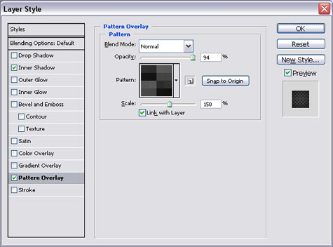
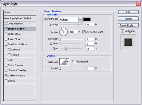
You can now close the carbon fiber pattern and return to the header. Apply the following layer styles to the header:
Pattern Overlay:
Your image should look something like this:

Create a new layer and add the text for your links. The font I use is called AddCityBoy and can be downloaded here. Space your links out evenly along the bottom of the header:

Now we need to add the lines to separate our links. Create a new layer then use the pencil tool to draw a 2px black line with a 2px white line directly to the left of it:
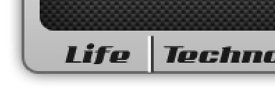
Now copy and paste the lines in between your links. When you are finished adjust the layer opacity to 15%:
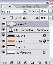
Your image should now look like this:

Now I add my sprocket and my logo text. Again the font used is Add City Boy this time 60px for the work “ProjectCrankwalk”. The color of the word “Project” is #043999 and the color of Crankwalk is #b00202:

Now we can add the layer styles. Reset your colors so that white is your fore ground color then, apply the drop shadow:
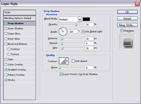
Now we can add the foreground to transparent gradient (this is why we reset our color swabs):
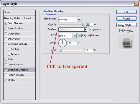
Before you close the layer style window, click the New Style button on the left and define a new style so that we can use it again later. The logo should look like this now:

Now I add the word “.com” using 16pt Add City Boy in the color #043999. Then I add my name because I am cool. It is 18pt Add City Boy and the Color is #222222.

(You can barely see them)
Then apply the layer style we saved by opening the layer style windows and clicking the “Styles” button. Now all you have to do is select the style you saved earlier:
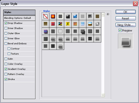
Apply the style to both the word “.com” and my name “by John Ward” if you used it. Then you are done (click to see full size image) :

