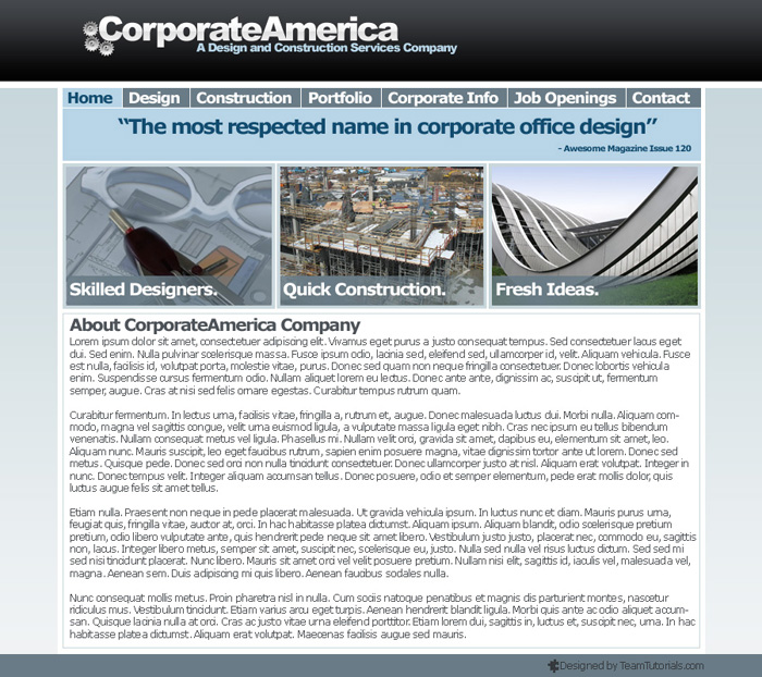
In our latest Adobe Photoshop tutorial, I will show you how to create a professional looking layout for a construction company. This tutorial that will take advantage of simple gradients to produce a nice effect. It is a pretty long tutorial, but it should be simple enough for newer Photoshop users to follow along.
Here is what the finished layout will look like.

First let me include links to all of the files used in this tutorial so that you can gather everything now.
Photoshop Add-ons:
DezinerFolio Ultimate Web 2.0 Gradient Pack
Images (all are available for free, but require you to sign up. It is worth it trust me):
Gears
Blueprint
Construction Site
Cool Building
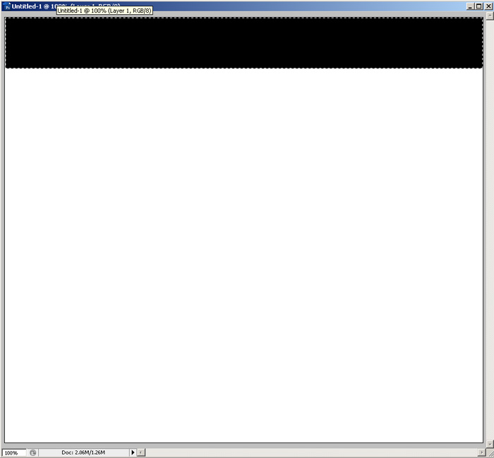
Ok, so now that you have all of the tools that you need open Photoshop and create a 900×800 pixel image with a white back ground. Create a new layer and use the Rectangle Marquee tool to draw a rectangle like below and fill it in with any color.
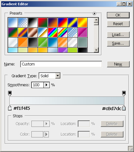
Now right click on the layer in the panel and select blending options. Apply the following gradient (this is included in the gradient pack):
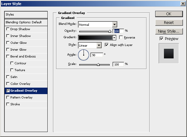
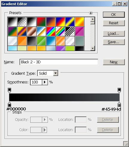
Here is the gradient. (If I don’t include this I will get flamed because somebody will over look this simple link to download all of the gradients here. That’s a hint guys)
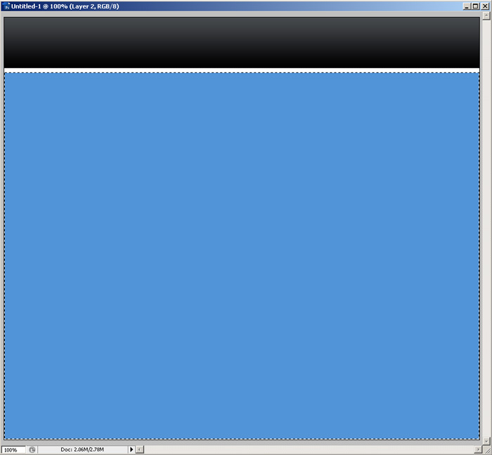
Create a new layer and draw another rectangle using the marquee tool and fill it in with any color.
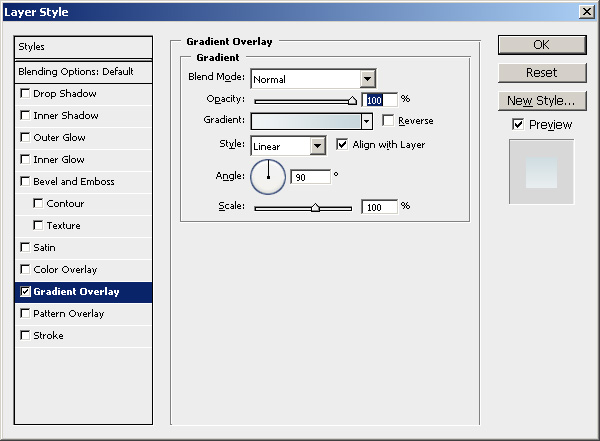
Right click on your new layer and add the gradient layer style shown below.
Create another new layer (we will be doing this quite often) ad draw another rectangle like below. Fill your rectangle with wjite (#FFFFFF).
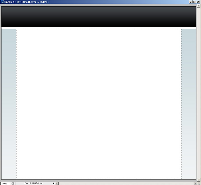
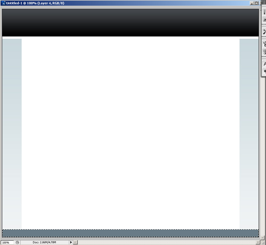
Make another new layer and another fancy rectangle. This time we will fill the selection with a #697b86.
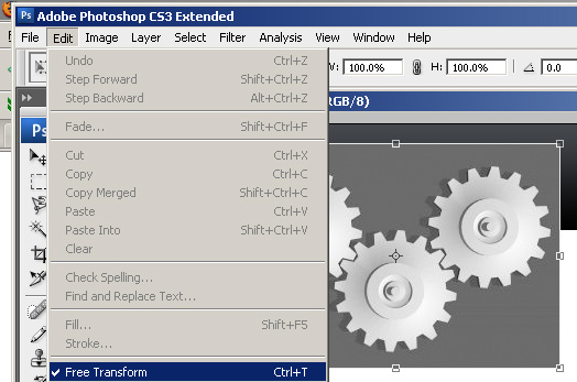
Next we will add the logo. Create a new layer and go get the gears picture from sxc.hu. Paste the picture into Photoshop. With the image selected choose Edit > Free Transform from the menu in Photoshop.
First we are going to Constrain Proportions by clicking the change link at the top, this keeps the image from becoming distorted. Then grab a corner of the image and shrink it down to size.
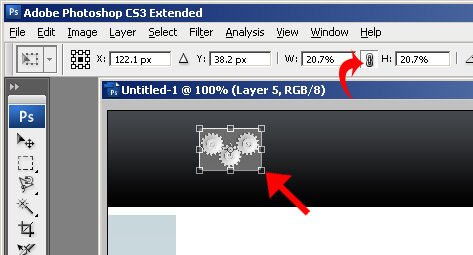
Then mouse your mouse out slightly until you get the rotate arrows (looks like a curve double sided arrow). Rotate the image so that it looks like this.
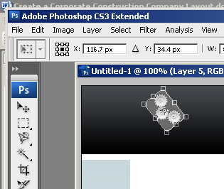
Apply your transformation. Select the layer in the layers pane and change the blend mode to Pin Light.
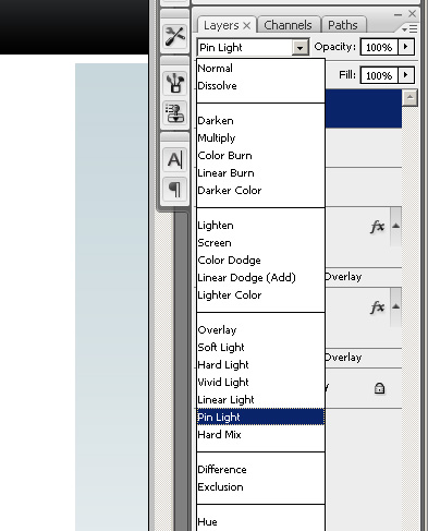
The gear image should now look like this.
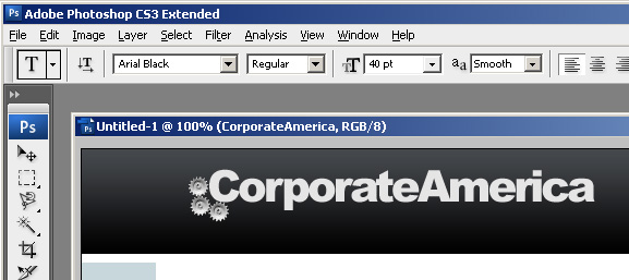
Next we will add our corporate logo. Using the text tool with Arial Black 40 point as you font type the CorporateAmerica logo.

Now apply the following gradient by going to blending options. This gradient is also included in the download I mentioned earlier.
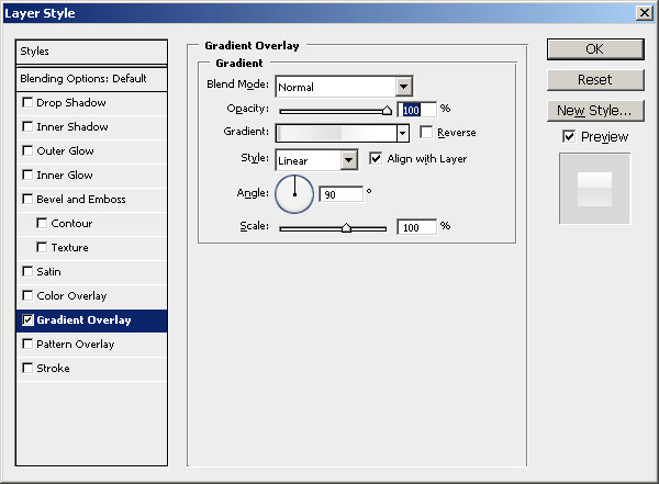
Here is the gradient. Make a note that some of the markers are covered by other markers. Those markers have arrows drawn to them. If you downloaded the gradient kit just click on gradient name “White Gloss 4”.
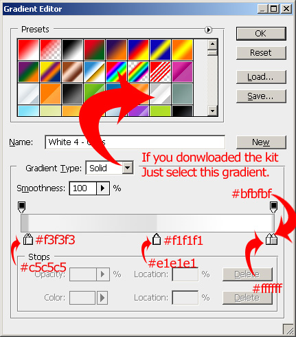
Now use the text tool again to add the tag to the logo. This time the font we are using is Arial Black 14 point with the color set to #b7d4e6.

Next we will create the menu. Create a new layer and draw another rectangle using the marquee tool. Fill this rectangle with #697b86

Now grab the text tool with Verdana 18pt Bold as your font and #ffffff as your color add the following links. Note that there are 4 spaces in between each sections link.
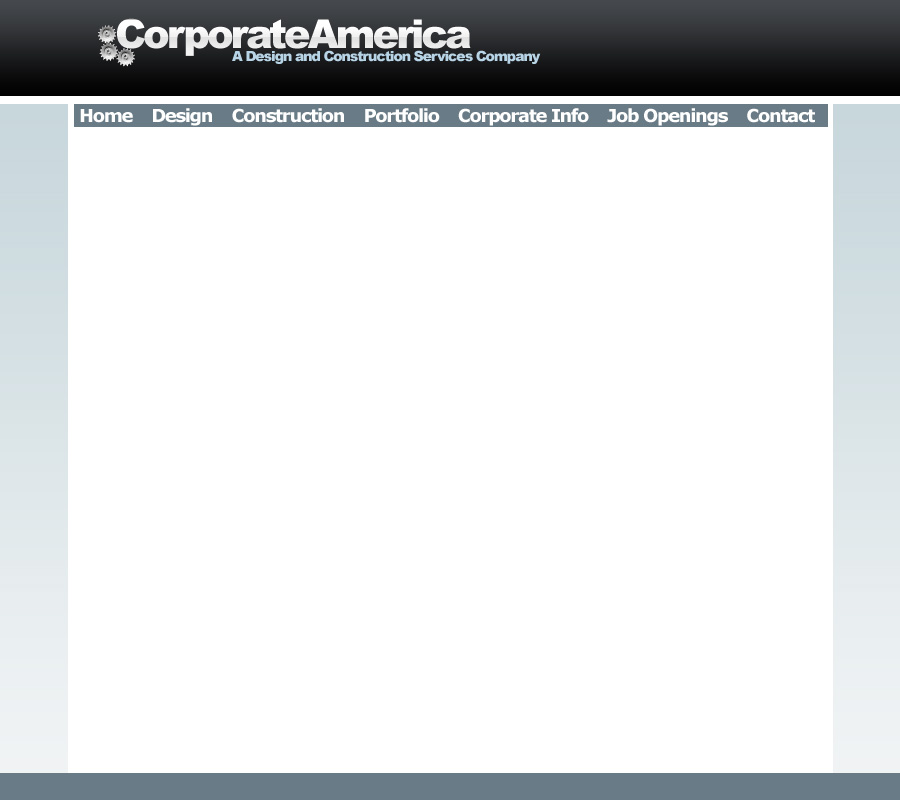
Select the rectangle layer again. Using the single column marquee tool select a section in between each link and then delete it. Your end result should look like the menu below.

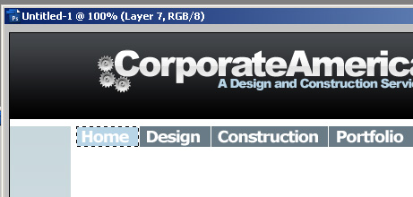
Now use the magic wand tool to select the rectangle behind the home link. Fill the rectangle with #b7d4e6. We are going to use this color to show what page the user is currently on.
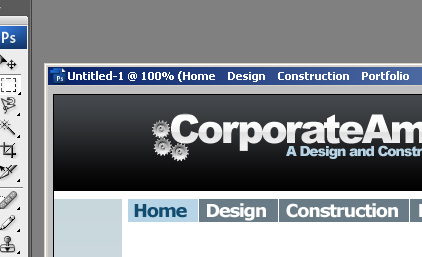
Now go back to your text layer for the links. Edit the links and change the color of the home link to #124c6f by highlighting only the word home and clicking the color box on the top menu. The menu should now look like this.
Create a new layer and draw another rectangle like below. Fill the rectangle with the same #b7d4e6 that we used to fill the rectangle for the home link.

Now we are going to add a magazine quote that describes the awesomeness of our company. We will use the text tool and Verdana bold 24pt for this with the color set to #124c6f.

We will also attribute the quote to the magazine using Verdana Bold 10pt in #124c6f.

Ok. Now we have to add the images that show a little bit about what our company stands for. We want to have three images equal in size. The easiest way I find to do this is to first create a new layer and draw another rectangle. Fill it in with any color.
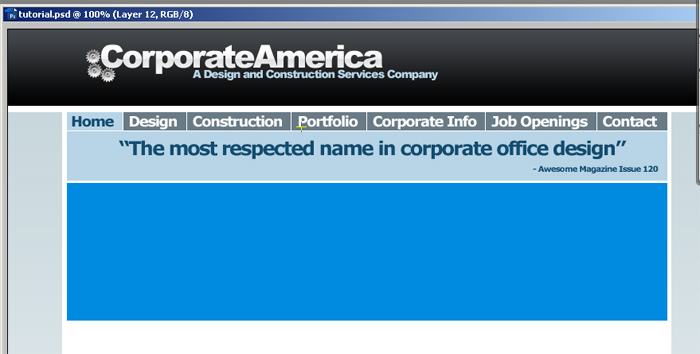
Next break the square into three equal portions. I will use the same technique that I used for the menu. Using the single column marquee I will delete two columns in between each square. You should get something like the picture below.
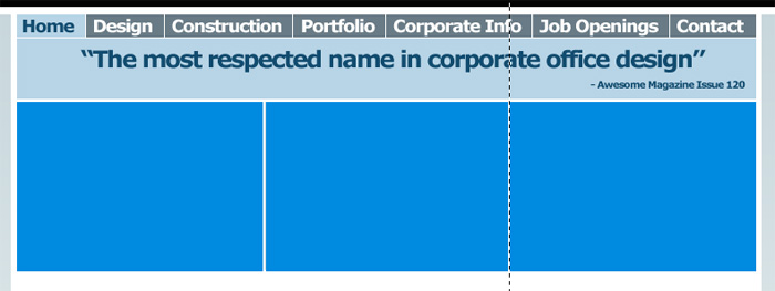
We will use this as a template for the images we downloaded earlier. First we will add the Blueprint image. We are going to paste the image in Photoshop. Then on the menu go to Edit > Transform > Resize. Constrain the proportions again (click the little chain links) and resize the image so that it is just slightly bigger than the blue square.
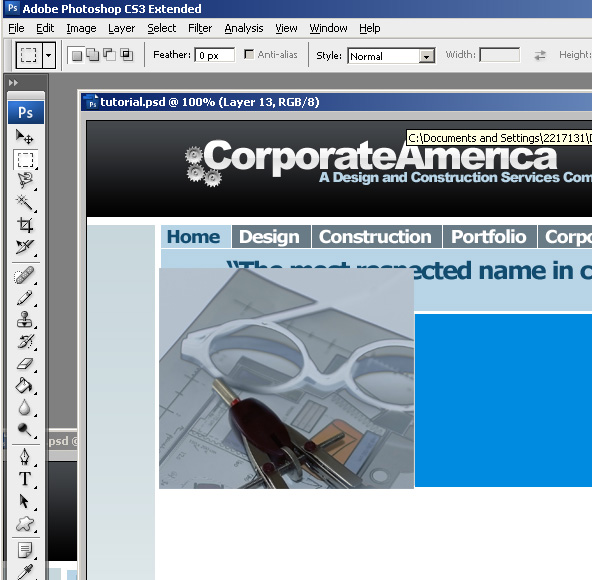
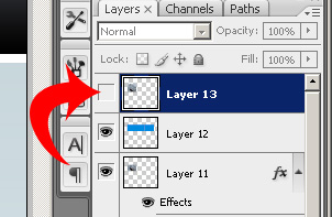
Now go back turn off visibility on the layer with the blueprint picture by clicking the eye in the layers panel.
Select the blue square layer and use the magic wand tool to select the first square.
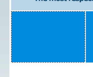
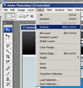
Now on the menu at the top go to Select > Inverse. This will select everything but the blue square.
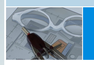
Now select the layer with the blueprint picture and turn visibility back on. Then make sure the blueprint layer is still selected and hit delete. The image should look like this now.
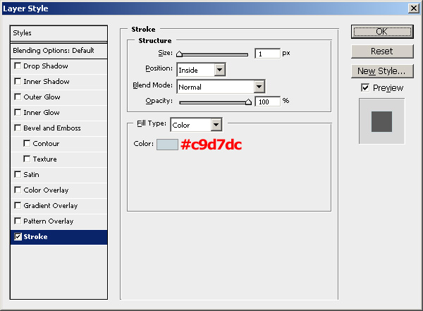
Now we are going to add a border. Right click on the layer in the layers pane and select blending options. Apply the follow stroke settings.
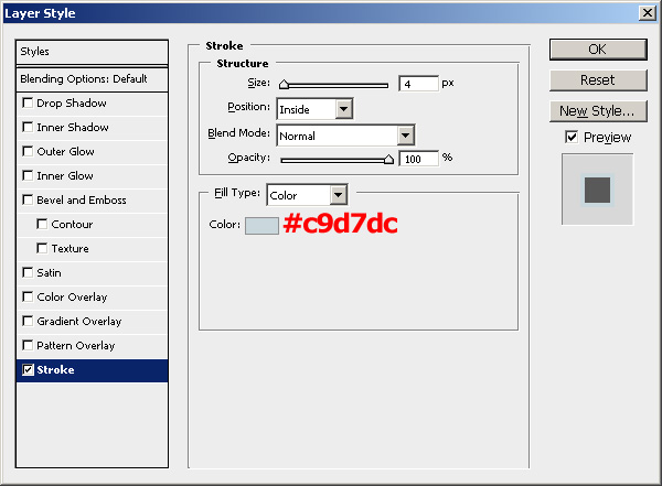
The image should now have a nice inside border on it.
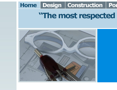
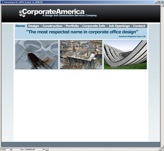
You will have to repeat those steps with the construction image and the cool building image using the 2nd and 3rd squares as a template. Also remember to apply the same blending effects. You can delete the blue squares layer when you are done. You should get something like this when you are done.
Now we will add a little caption to the images. Create a new layer and make a selection using the rectangle marquee tool on top of one of the images, but inside the border like the one shown below.
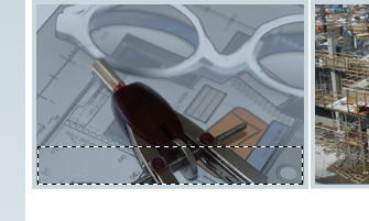
Now select # 697b86 as your foreground color. Then select the gradient tool.
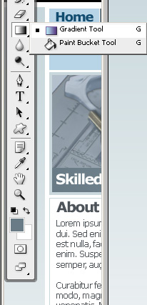
On at the top of the screen click the gradient drop down and select “Foreground to transparent”.
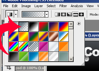
Now hold down the shift key if you are on windows (sorry I don’t know Mac shortcuts) and click and drag from slightly inside the left of the box ending outside the right side of the box. The illustration below shows where I started and finished
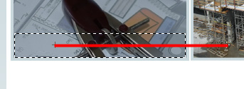
The fill should look like this
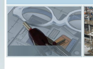
Right click on the layer and duplicate it. Use the arrow keys to position the new layer on the next image. Repeat this for the 3rd image. Your site you now look like this.
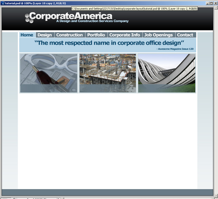
Next use the text tool with Verdana 20pt bold as the font. Add the text below to each of the images.

Create a new layer. Make another rectangle and fill it with white.
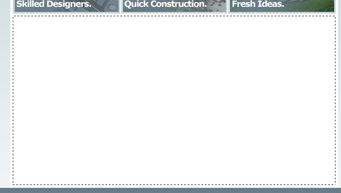
Go to the blending options for the final rectangle and apply a 1px stroke.
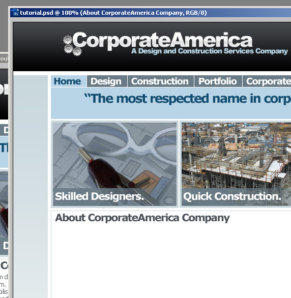
Now use the text tool to add the title to the about page. The font is Verdana Bold 20pt and color is # 4d5359
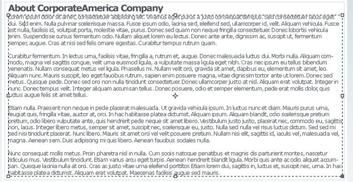
Next we will add the description. Since I don’t feel like making up a description we will use the lorem ipsum generator (http://www.lipsum.com/ ). If you don’t know what lorem ipsum is. It is supposed to simulate what standard writing would look like. I generate 5 pargraphs and added it to my image using Verdana Regular 12pt as the font.
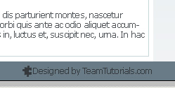
The last thing we will do is add our tag to the footer so that people will know who the site was designed by. The font is Verdana 12pt regular and the color is # 35393d. The puzzle piece is a default shape that you can find using the shape tool.
We’re finally done. Here is our finished layout. Click the image for the full size.
